Saturday, 2 April 2011

FOOD FOR THOUGHT

Had a quick chat with Jonny today, i was feeling at bit bored with what i was doing so he looked over my work and gave me some ideas as to what alternative directions i could take them. He told me to take a look at films such as Brazil and Blade runner (both of which i have seen but not recently) to see how the directors portrayed the future. I viewed clips to refresh my memory of the films, and both are fairly different. Jonny suggested that i could use my machines to create a altered vision of the future possibly by having the world run by these machines. He also suggested that i could add some comical value, we came up with an the idea of imagining if one of these machines were to break down, and focusing on the one man with a scanner who's task is to find the problem. All these ideas we generated were very refreshing, and its nice to know that if i do come to a dead end i could variate my idea slightly and not have the work ive done so far go to waste.
BRAZIL,  it vision on the future is a surreal one.

BRAZIL, some human integration in my project could work, somthing i must try.

BLADE RUNNER, grimy vision of the future, if i were to create my own i would make it gritty like this.

BLADE RUNNE, nice lighting in this screen shot. 

Friday, 1 April 2011

POP TABLE DESIGN

Soooo, i finally got my table design done, so get your asses down to Pop and eat a pizza off it! ENJOY
 
Spray pained base coat, dark to light blue gradient (with some cheeky splats of other colours)
Masked out a spiral with tape, then sprayed with a yellow.
taaa daaaa!
painted some duck outlines, including a rouge red one (bottom right)facing the wrong way :O 
 Penned in the outlines
Final outcome (click it to enlarge)
Shameless self promotion...
Tarquin2011
blogspot

Tuesday, 15 March 2011

RETSU TAKAHASHI

 Today i found this american Artist Retsu Takahashi whilst searching for artists who use a lot of line in their work. Retsu draws a lot of architecture with amazing detail. Its nice to see that his images are so rich without the use of colour. also love the amount of depth and perspective he can capture in his drawings. From looking at his work i will definitely take note of his techniques
Love the amount of depth in this image

such great detail in this, really great perspective.

selected colour in this works really.

Sunday, 13 March 2011

POP!

The Bar Pop in Southampton approached me few months back and asked for our illustration group to do some artwork in their venue. The manager Barry wants a lot of artwork, its a perfect link for our course, in return for doing free work we get exposure and a chance to use the bar as an exhibition space. Our tutor Jonny Hannah is fully on board, which is amazing. 

Stage1 Prepping Tables. 
This morning we started by preparing tables. There are 10 in total, 4 large and the rest smaller. We got sanding and base coating today! ready for next Sunday when we will have some stencil designs ready for applying.

Jonny sanding
sanding...
...and more sanding!
Painting!
Doughnut time!

Thursday, 10 March 2011

FMP UPDATE

YEP, its probably about time i update what is actually going on with my FMP. These last few weeks have been a real struggle, with dips in inspiration, and consequently motivation, but now im on track with an idea that i aim to see through!

My time in the print room was a push i the right direction in terms of finding an amazing medium to work with, And Ive come up with an idea that i think will complement the method nicely. Machines and mechanisms have been predominant in the work i currently do, so i want to try and produce a body of work that will sum up that area of my illustration. I had chats with Derick who suggested some people and things to get some inspiration from, Jean Tinguely was one. Although sculpture really isn't my sort of thing, the dense and complicated structures jean creates fascinated me! It gave me some ideas towards a way i could draw machines, with high density and complex shapes.
Jean Tenguely
Ive done alot of sketchbook work, exploring moving and interjoining parts. In light of Jeans work i even raided the skips at uni and found lots of mechanical bits and bobs, and have done studies from them.


scrap bin loot!
i love this fan.


My original idea was to create a series of machines that represent the 4 elements, Earth, wind, water, and fire. The basis behind this was to reinvent something that is so naturally pure into a complete opposite, a man made structure.  Here is the first image i created, (and also used in my FMP poster), it represents the Wind element, I did this by incorporating huge turbines.   
its extremely detailed, and i think i got the right level of dense line work to create an interesting image that i am very pleased with. The image above is actually an A1 screen print, the original is in on A3 and is drawn completely free hand with fine liners. Yep!  
Here is the screen. I got the image blown up and printed on A1 tracing paper and then exposed it to the screen, the printing didn't come out so great and the black line wasn't particularity strong, so the negative image didn't come out as detailed as the original.  

I also added 3 layers of color to sit behind the black outlines, as you can see above i did this by laying acetate over a print and blocking out the colored areas. For the colors themselves i was very experimental, I chose some very bright pink purple and greens, which i think gives it a very 1980's feel, which i really like. 

(NOTE) A member of fine art organised an arts fundraiser on Monday, the theme was "Visions of the Future". They saw my work in the studio and asked me if they could exhibit these prints. i said yes of course! and they received a great response, even enquirers about sales - good times!
my work being displayed at the event
and the black and white one...


Friday, 4 March 2011

update baby

Self promo crit.
just as i feared... there was a bin, 2 bins in fact! but one was a friendly head witch was for the all the good stuff, the other was a standard bin where all the unlucky promos were to be placed. 
There's the pile of posted self promo's and the good and bad bins.
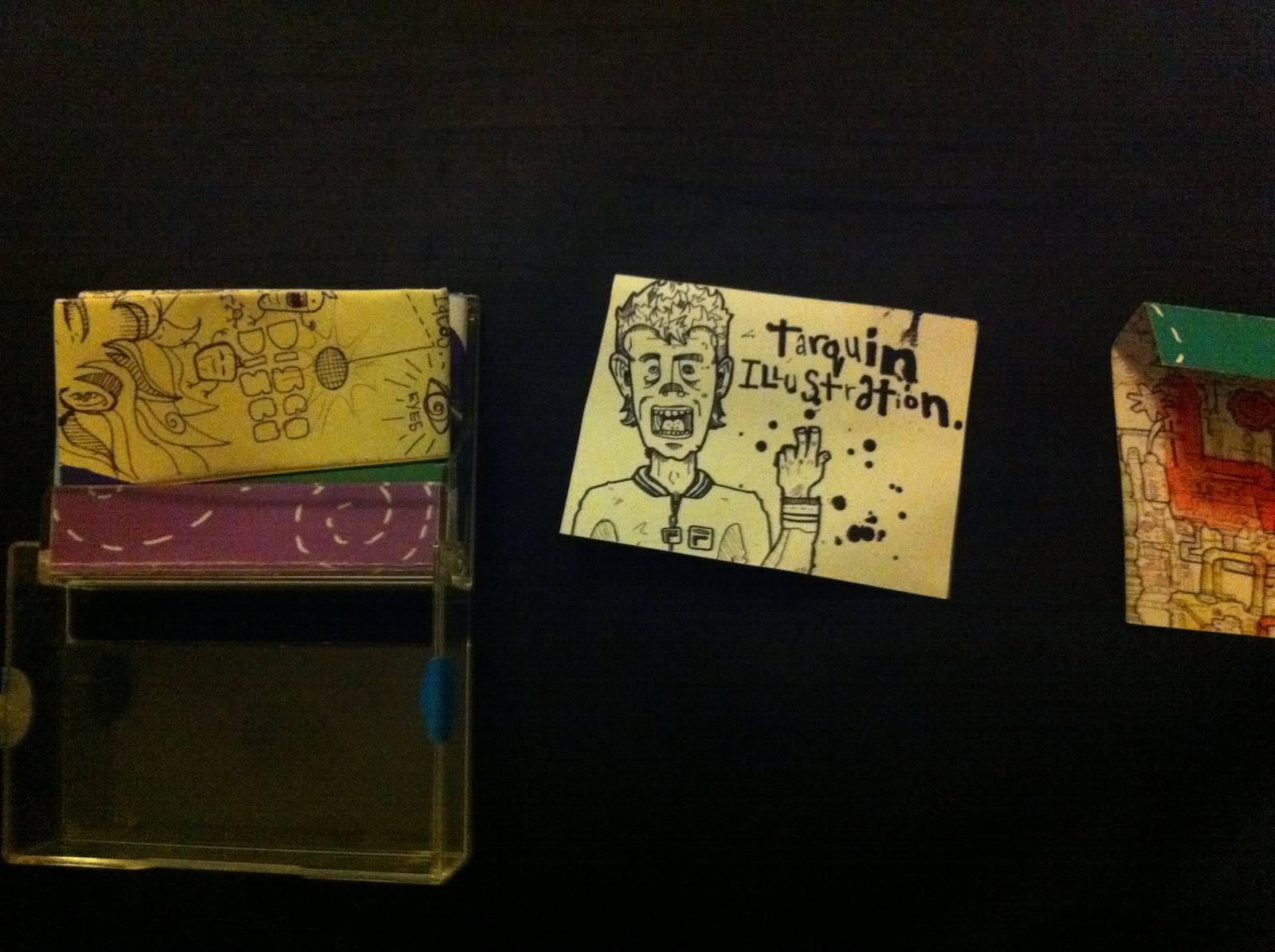
Heres the package i put together, it got in the good bin! they generally liked what i did, they just had issues with the production values, as it was all printed on cheapish paper and the folding was a bit dodgy. things to defo think about when sending out some final self promotions in the future.
A stamp fits nicely into on the corner there.
Had some little stickers to seal it and stop it opening in the post.
contact card
poster folds out.

lots of em!

Tuesday, 1 March 2011

SELF PROMO PACKAGE BOOOOM!

sooo ive recently completed my self promotion project, sent it in the mail yesterday. It consists on a mini dv tape case filled with a poster and a contact card, pretty basic idea but it could be  effective and different enough to catch peoples eye if it came through their postbox.
Heres the poster, which folds into the case, ill upload the case later as my iphone has no juice!

MINI POSTER SIDE 1...crazy assed machine


MINI POSTER SIDE 2 doodle book stuff
Ive sent this to my tutor though the wonders of The Royal Mail, and its being critiqued along with the other class mates on thursday. Apparently theres some lead designer coming in, (as he gets tonnes of these through the post everyday from budding illustrators) to come and lay his JUDGMENT on what weve done... I hear theres a bin involved, i'm scared...